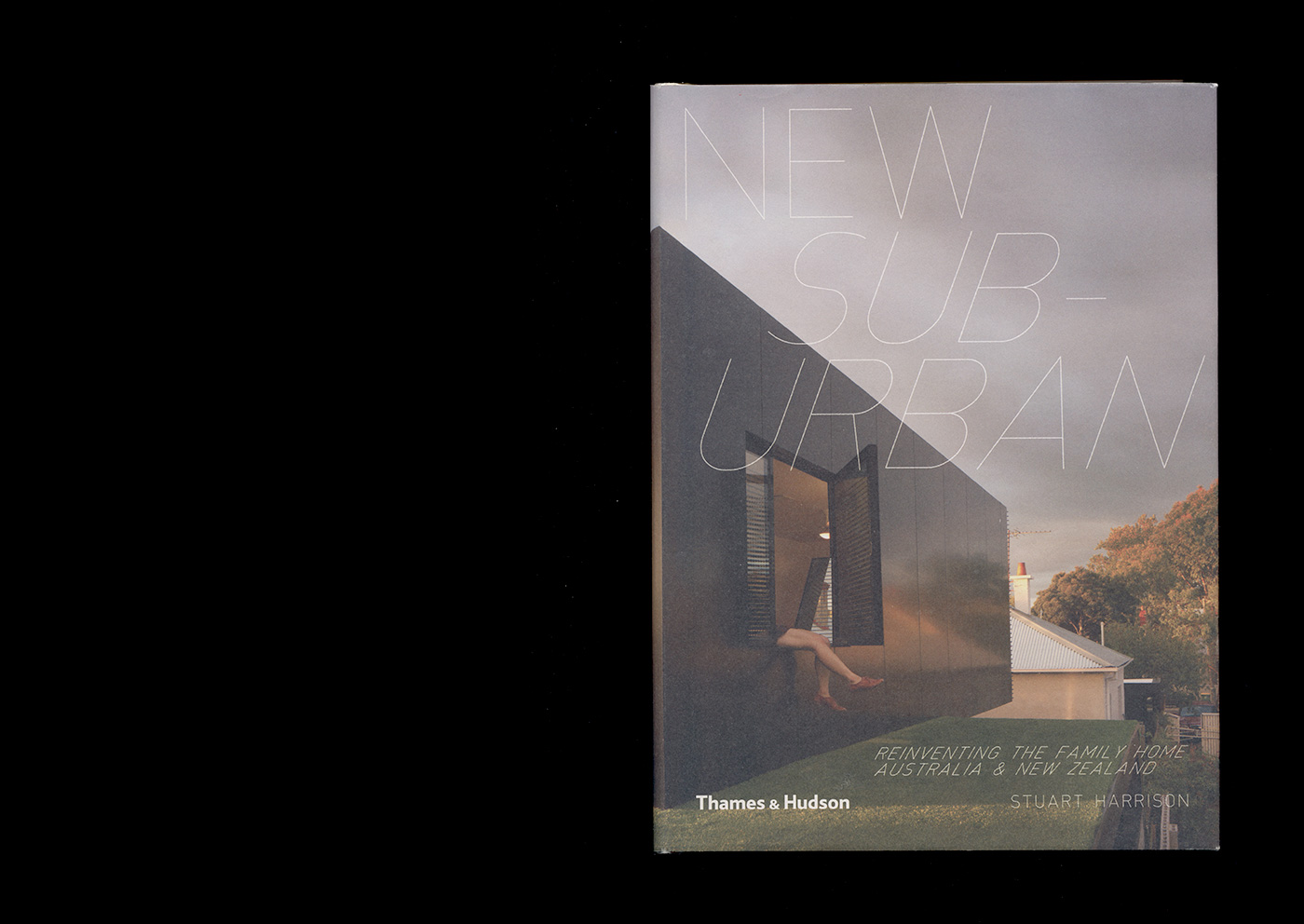
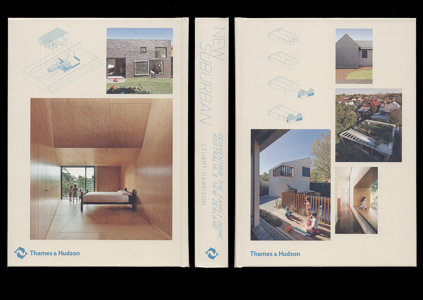
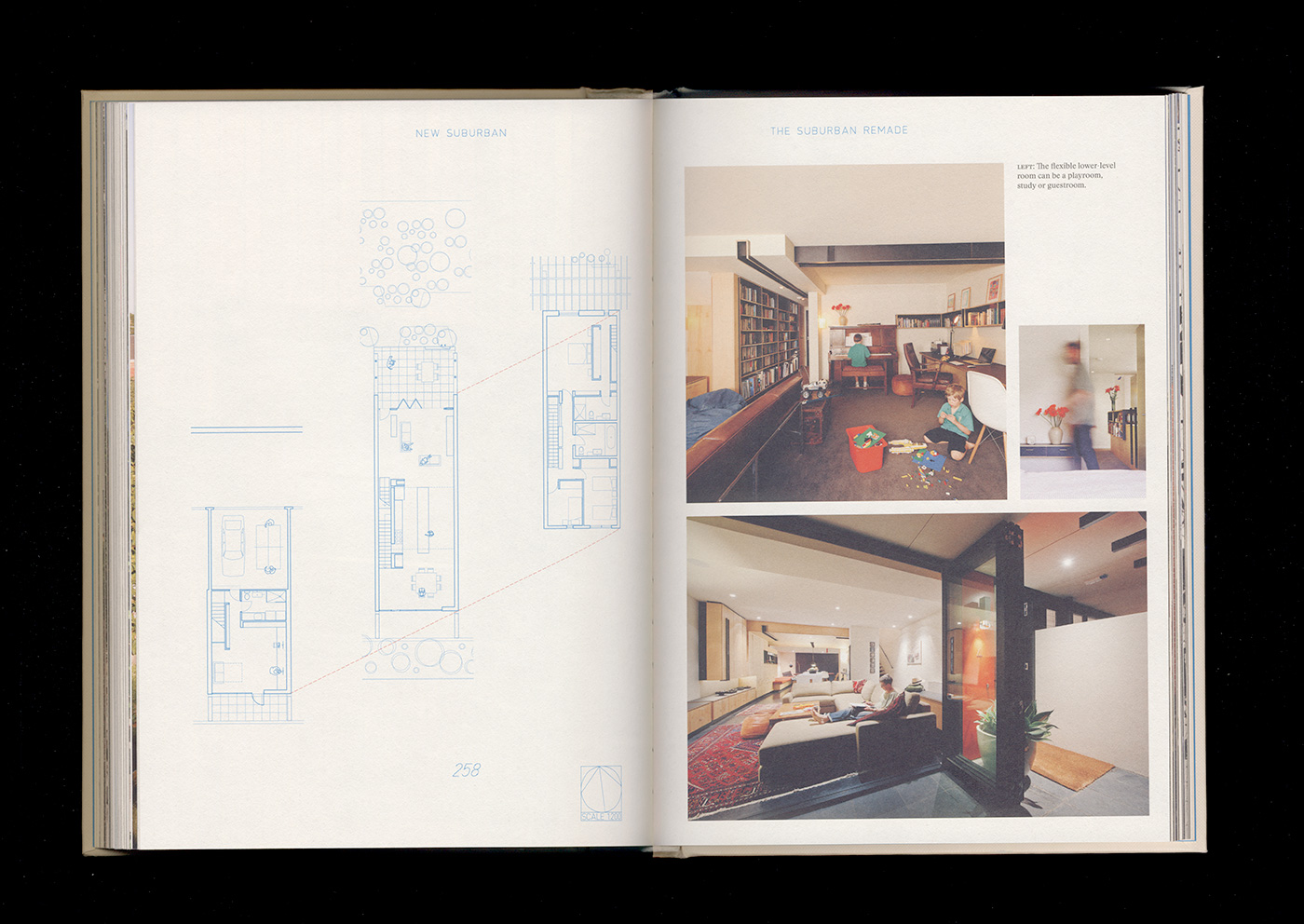
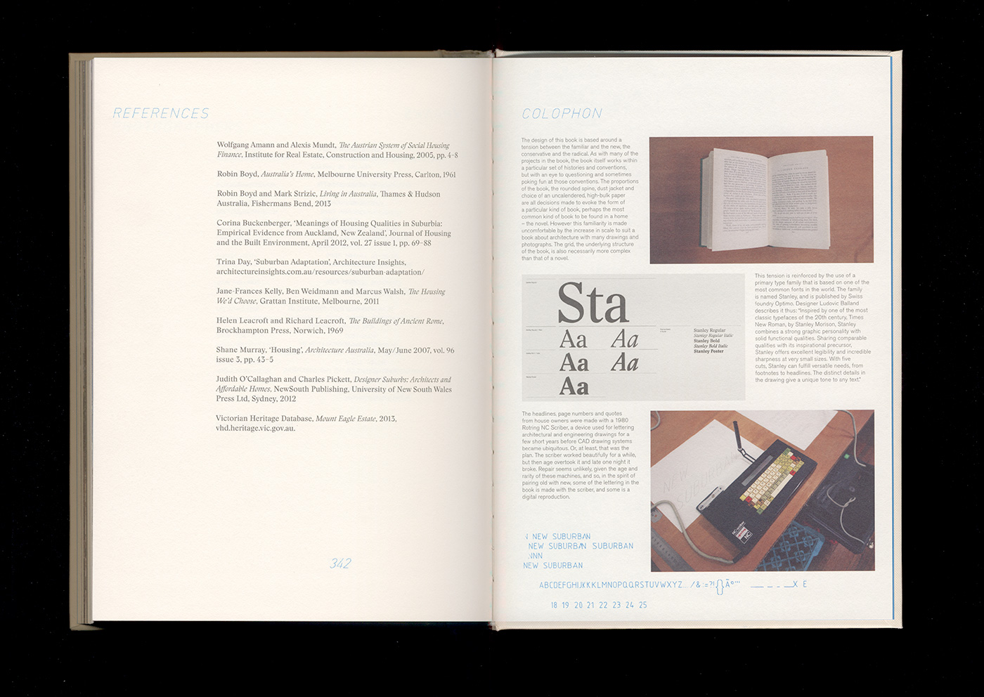
The design of New Suburban is based around a tension between the familiar and the new, the conservative and the radical. As with many of the projects in the book, the book itself works within a particular set of histories and conventions, but with an eye to questioning and sometimes poking fun at those conventions. The proportions of the book, the rounded spine, dust jacket and choice of an uncalendered, high-bulk paper are all decisions made to evoke the form of a particular kind of book, perhaps the most common kind of book to be found in a home—the novel. However this familiarity is made uncomfortable by the increase in scale to to suit a book about architecture with many drawings and photographs. The grid is also necessarily more complex than that of a novel.
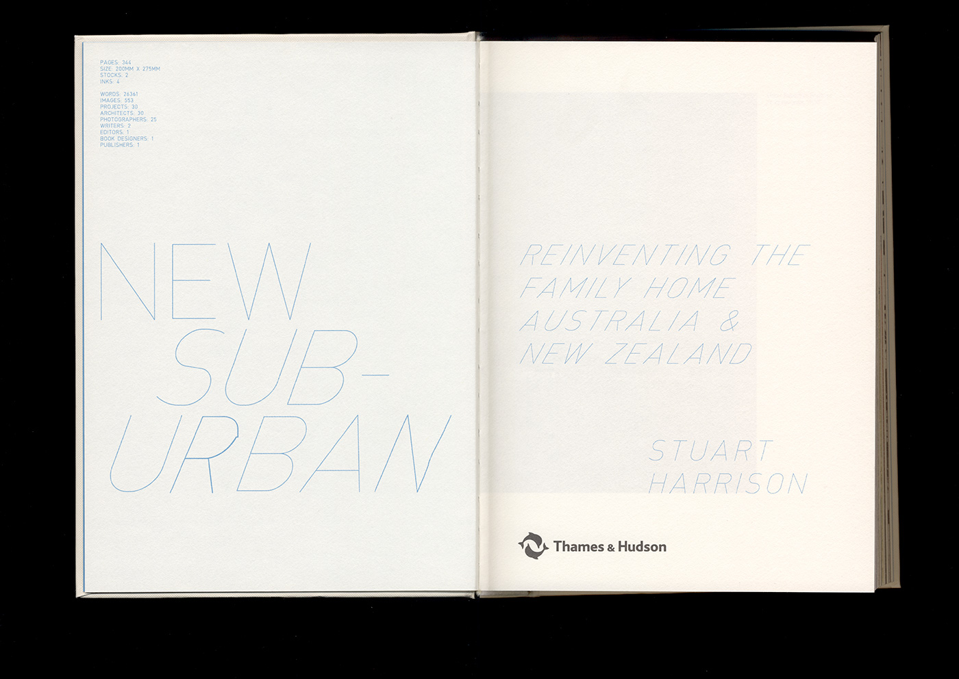
This tension is reinforced by the use of a primary type family that is based on one of the most common fonts in the world. The family is Stanley, named after Stanley Morison, the designer of Times New Roman.
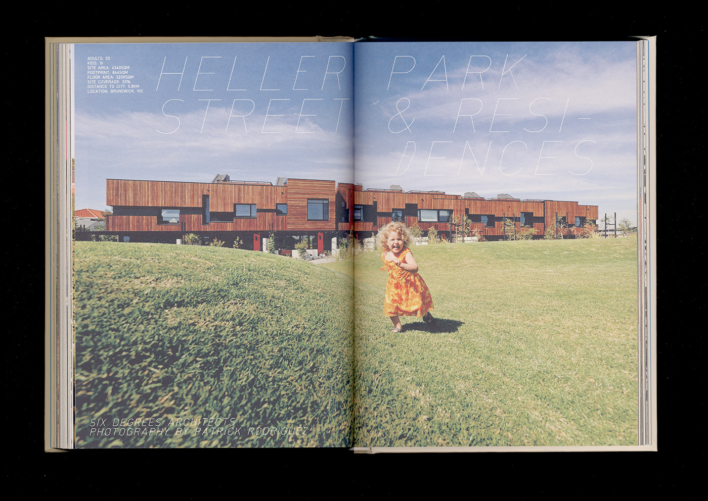
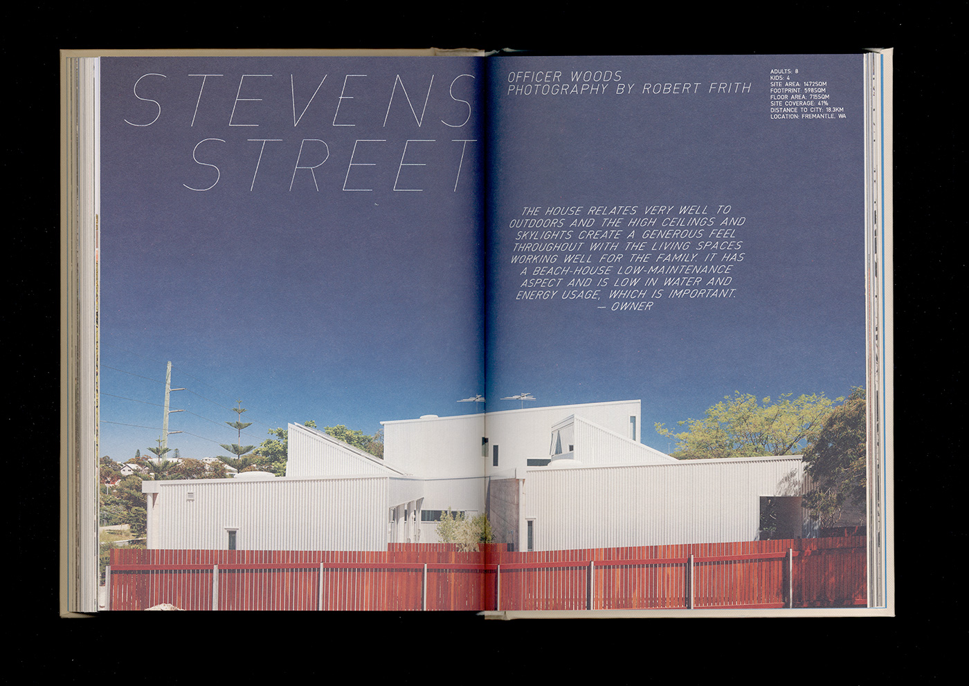
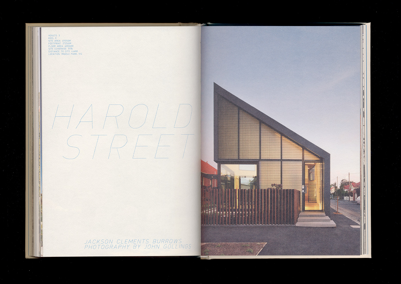
The headlines, page numbers and quotes from home owners were made with a 1980 Rotring NC Scriber, a device used for lettering architectural and engineering drawings for a few short years before CAD systems became ubiquitous. Or, at least, that was the plan. The Scriber worked beautifully for a while, but then age overtook it and late one night it broke. Repair seems unlikely, given the age and rarity of these machines, and so, in the spirit of pairing old with new, some of the lettering in the book is made with the Scriber, and some is a digital reproduction.